Having had a problem with the data collection during the Leonids in November, I’m glad that my Geminid observations over the last two weeks seems to have been successful.
As I mentioned in my entry on 3, November, I wanted to use the output from the Plotter rather than the scripted output of SpectrumLab. The reasons for this are :
- The Plotter output can be set to record a minimum and maximum power reading every second, rather than a scripted reading whenever the signal is above a preset level.
- The ability to record a Min and Max reading means I don’t have to worry if the mean background level of the received signal goes up or down over time- which it does and by quite a lot.
- I don’t have to figure out how to use the scripting language to accomplish the same results.

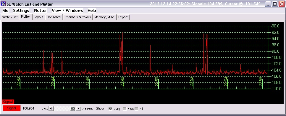
The plotter graph shows the background noise level at -105dB with peak readings of anything between -102dB and -92db. Over a course of a few days I found that the small meteor detections measured about 3 dB above the base noise level, medium about 6 dB above and the larger ones 9dB and over.
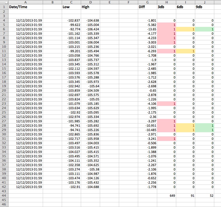
To extract all the data from these readings, I imported the plotter data into Excel. For each one second line I deduct the low from the high power reading, to give me the difference in decibels. I was intrigued to see if there was a difference in counts per hour between the smaller, medium and larger power readings. The column marked 3db is any peak reading between 3db and 6db above the background base. The 6db column counts readings above 6db and below 9db, The final column is any reading above 9db. All I then had to do was count up all the ‘Ones’ in each column to give me my counts per hour for each power level.

With 3600 data points each hour, it was simple enough to tell Excel to count the totals for each column every 3600 lines and enter that data in another sheet to give me counts per hour. It was at this point that the wheels started to fall off!
For some reason, the plotter doesn’t record data 60 times a minute, despite the setting being set to record 1 second per plotted step. For each hour there could be anything between 3700 and 3500 readings an hour, so over a 24 hour period I was finding that I could have anything between 23.5 or 24.5 hours worth of data. While this isn’t really a problem for a graph that’s just plotting the changes over say a day, it wasn’t going to be any good if I wanted to accurately time when a particular peak started or what time it had peaked.
You can therefore see that my plan of totalling the columns every 3600 lines wasn’t going to work and that I had to make the cell total ranges manually. A rather time consuming task and something I’m going to have to fix in the future
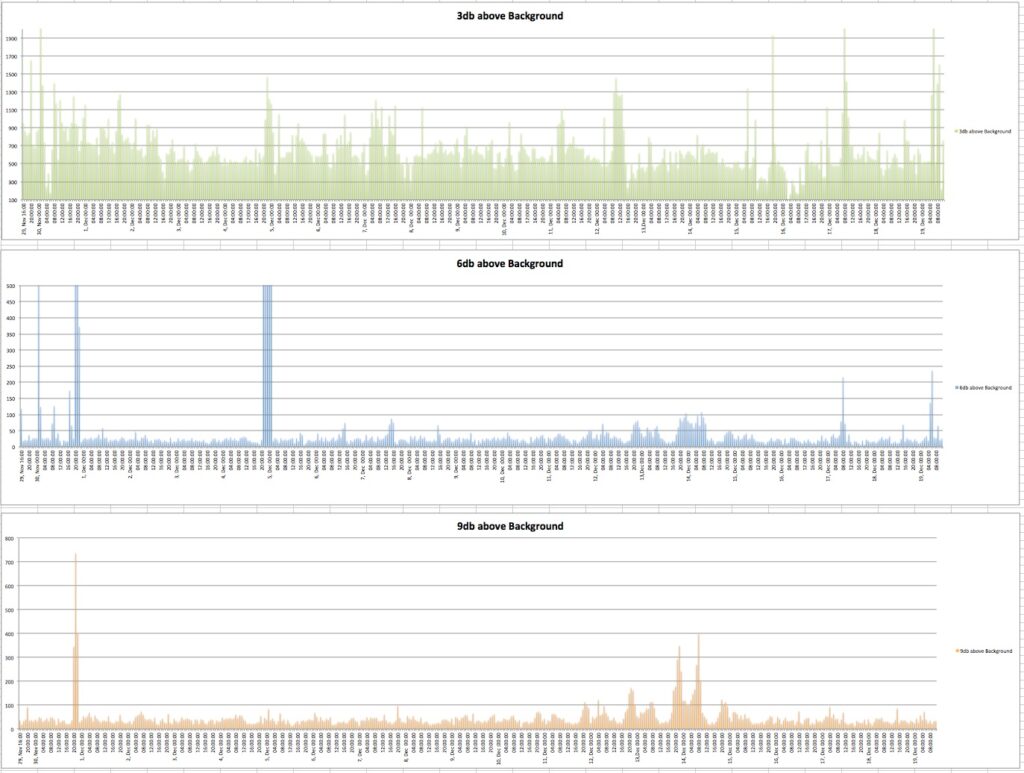
With all the data entered, below are the plots for each of the three power level readings. (Click the charts to get full sized versions)

Firstly there are a couple of way out readings in the 3db and 6dB charts between 20:00 and 00:00 hours on the 4th, December. These are out of all proportion to the readings in the 9dB chart, so I’m tempted to conclude these are some outside interference rather than genuine data. Having said that, the high readings are high over a five hour period, so the inference must have been sustained. The readings from the spreadsheet are given below.

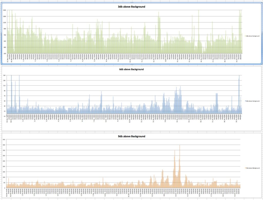
Taking out this ‘interference’ by substituting data from the point before the readings when tits up and adjusting the scales a little, I end up with the following plots.

From the 3dB chart, it would be difficult to say when the Geminids peak was, but looking at the 9db and to a lesser extent, the 6dB chart, it is obvious. What is also noticeable is that meteors with power levels between 3 and 6 db above base, for the most part, are fairly consistent throughout the whole three week period, where at 9db above, there are considerably more higher power returns during the Geminid peak.
Another interesting point is there is also a steady decline in activity from the 30,November to the 4, December on the 3dB chart, but this isn’t reflected in either the 6 to 9dB charts which seem to show a fairly level baseline trend.
The 9dB and 6dB charts, provides the clearest view of the increasing activity towards the Geminids peak on the 14, December, as are the three increasing daily cycles which start late on the evening on the 10, Dec towards the peak on the 14, Dec. followed by the decreasing single daily peak on the 15, Dec.
I’ve also been recording data provided by the SpectrumLab script given to me by Paul Hyde. This is just recording readings above a preset power level, but also includes the duration of the Ionised trail for each of these readings. The duration counts work out at an average of 2.7 second per count. However, on 12 randomly selected readings I could count an Ionised trail lasting six seconds having a reading of nine units, while another data point gave a trail of ten seconds, with a reading of two units. This does seem to be quite a spread. Assuming the script is actually providing a consistent seconds/unit count ratio, I can only conclude that the difference in my reading of the jpg images that provide this data is due to the settings of the ‘Colour Palette’ sliders being set quite dark. This might hide some of the fainter data in the Waterfall plot, thus making the visual power plot look of a shorter duration that it actually is.

The duration plot doesn’t divide the X axis into evenly space 24 hours periods, so the spacing between each 24 hour period depends on the number of script activations. From this I note that the number of data points during the quiet periods between 1, December and 10, December is fairly consistent. But as the Geminid cycle starts to build on the 10, December, the script activations reduce as the days pass.
Once beyond the Geminid peak on the 14, December, the daily counts from the 15 to the 19, December are similar to just one days worth of a quiet period.
The increasing duration of Ionised trails build from the 12, December towards a concentrated peak during the 14, December. This seems to correlate with the data on increasing higher power readings from the 9db plot.
While this has been an interesting long term exercise, the amount of entry of about 1.7 million data points and breaking these down into 24 hours totals is far too labour intensive. While using the Plotter output seemed to be a good idea, I think I will have to go back to using the Duration Script and count the daily totals for entry into the Spreadsheet. The 54,000 data points is far quicker to calculate than 1.7 Million!